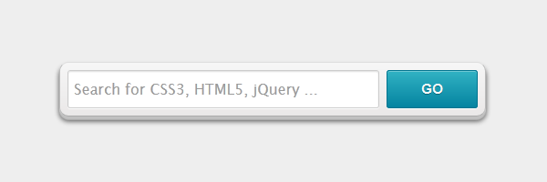
One of the elements most frequently used by websites is probably the search box. If you want to improve user experience in a simple way, and make it easy to search and find content for your users, then you have to add a search form on your website.
So, today we’re going to cover how to style a search form using the most exciting CSS3 features.

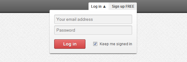
Users log in every day on the web, so imagine how many times login forms are being used in a single day. Usually, it doesn’t take too much to fill a form like this, but using a dropdown solution will speed up things for you.
In this article, you will see how to create a good looking dropdown login form using CSS3 and a bit of jQuery.

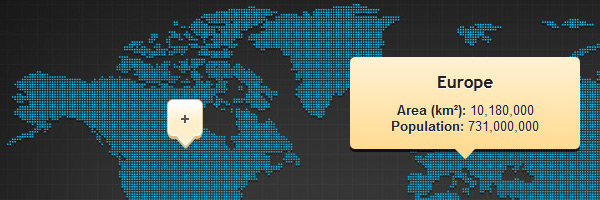
Tooltips can play a big role in your web designs and that isn’t new anymore. Just use them correctly and they will help you improve user experience.
We have seen before how to create some good looking CSS3 tooltips and today you’ll learn how to create an image map with pins and tooltips.

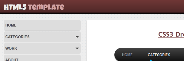
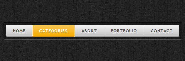
We all try to be very creative when it comes to designing a website navigation. It’s a sure thing: a good looking navigation menu can really enhance your website.
I wrote before about how to create different menus and today you’ll learn how to create another stylish CSS3 navigation menu.

There has been some discussion in the past about how or when to use tables in web development. Though, the conclusion is the same: when you’re dealing with tabular data, tables are absolutely required.
Designing a table is a challenge - and here I’m not talking only about the way it looks. It’s mostly about how easy is your table to read. If your table isn’t easy to scan, usually users get annoyed as they lose focus when trying to find the right column and row.
Having said that, today we’re going to create beautiful and practical tables styled using CSS. Also, jQuery will be used to create fallbacks for older browsers.

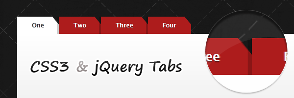
Organizing content was always an important task for web designers. Just like accordions, using CSS tabbed navigation can help you structuring similar groups of content.
Besides so many rounded corners tabs in the wild, today you’ll learn how to create some CSS tabs with beveled or slanted corners using a clever CSS gradients technique.

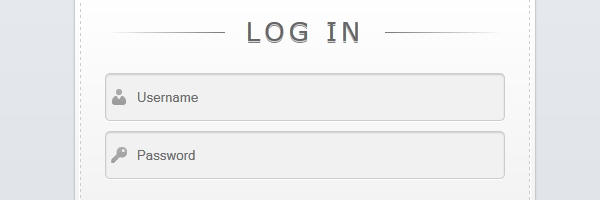
We already know that CSS3 has the ability to create a lot of new possibilities to design and implement better web forms. Also, HTML5 has its important role when it comes about creating more usable forms, without actually needing any Javascript code.
Knowing that, check out the below preview to see the login form we’re going to create in this article:

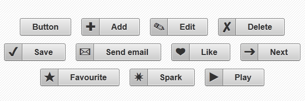
Whether you’re designing a website or a web application, you’ll need buttons for it. Now, with CSS3’s help, it was never easier to create nice looking buttons.
In this article you’ll learn how to create some cool CSS3 buttons in just a few steps.

At my beginnings as a web developer, when I first discovered how to clear floats I was so happy and it was for sure an “a-ha” moment. Since then, so many things have changed and new clearing methods have appeared. One thing remained the same: the need to clear floats.
In this article, we’ll see some effective solutions for clearing floated elements.

HTML5 is certainly one of the latest buzzwords in the web community. It isn’t something new anymore and we’ve already seen how cool it is. Features like simplified doctype, more semantic markup, input types and placeholders are just some of the reasons you’d like to use a HTML5 template.
So, today we’re going to build a HTML5 template using the full power of CSS3.
