The :target pseudo-class is one of those amazing CSS3 features. It matches an element that’s the target of a identifier in the document’s URI.
This identifier in a URI contains a “#” character followed by an identifier name that matches the value of an id attribute of an element within the document.

CSS3 has brought some amazing new features and continues to do that. One of the most interesting and attractive feature is the CSS animation. Below is a CSS3 animation round-up that shows you the mighty power of CSS and what you can achieve with its help.
These animations aren’t available to use for all browsers. So, in order to enjoy these effects, you should have WebKit browsers like Safari and Chrome.

I love shadows, rounded corners, gradients and all the CSS3 features. That’s why, there are some days when I find myself designing in CSS3 more than in Photoshop.
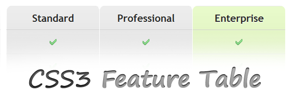
The idea of building a features table just by using CSS3 came to me a while ago and I decided to share it with you in this article.

Writing CSS can be a pain and can give you headaches. The truth is that CSS ain’t rocket science and you should just have in mind some CSS pieces of code (snippets) you can use everytime.
In the following rows I’ll try to present you some important snippets I often use in my project and I hope these will help you too.

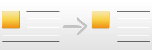
Have you noticed how often you see an image and a paragraph next to it, with the text wrapped around the image?
That is something easy to do. Just add float:left to the image and the text will wrap around that image.
But what happens when you want the paragraph to look like a block next to the image? Without wrapping it under the image. Here comes the tricky part.
However, with this article, I will show you a quick solution to this issue. Actually, a very simple and fast trick, but very useful in these cases.

A while ago you’ve read a quick tutorial here about setting up your website with custom fonts using @font-face. Since then I’ve been thinking to write about these alternative solutions, pros and cons.
The aim of this post is to briefly round up your options when using custom fonts in web design.

CSS gradients aren’t something new, but because of cross-browser incompatibility, they weren’t used that much until now.
However, you should know that they are available to use in Safari, Chrome (Webkit) and Mozilla Firefox (from 3.6) browsers. In this article, you will learn how to use CSS gradients, available in some of the major browsers: Firefox, Safari, Chrome and IE (surprise!).

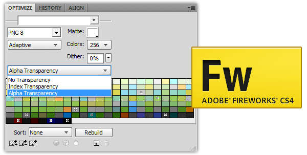
PNG-8 with alpha transparency?
I know some of you will say that this is impossible, because that was exactly what I was saying when I found out about it.
But, Adobe Fireworks makes itself “guilty” about that and in this article I will show you how you can get a PNG-8 image with alpha transparency.

Web designers have been constrained to use a limited number of safe-fonts due to the dependence of being available on various computers and operating systems. CSS3 changed that by introducing a feature that allows you to use any font for your website.
This article contains a simple and easy to implement tutorial about using the @font-face property.

Working often with CSS for my own website or for my job makes me trying always to be organized and that made me thinking about a thing. What is the best way to organize my CSS file(s)? With this article I will try to present you a short guide about CSS organizing.
