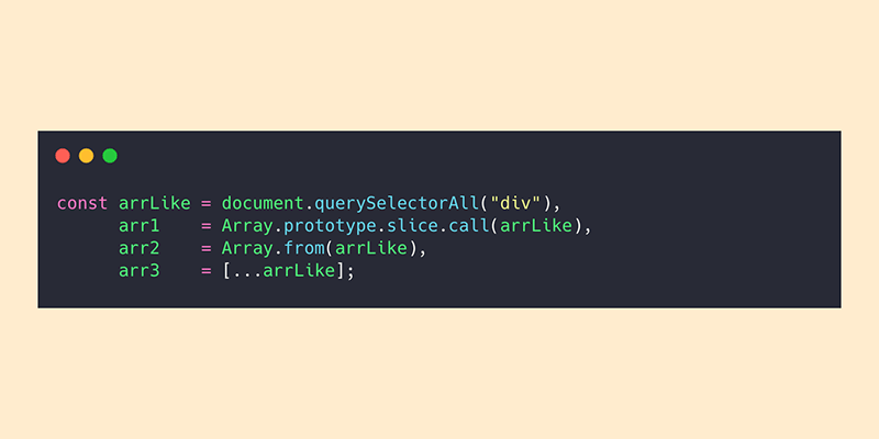
I remember the struggle and the misunderstanding as I was trying to iterate over a NodeList collection with no success. In this article you’ll see how to convert an array-like object like NodeList to a real Array using different methods.

I gave a quick talk on JS a while ago on hoisting in JS and while discussing on how hoisting apply to variable declarations, we imminently reached to ES6’s let and const. So we began talking about the difference between var, let and const and how const is not really a constant or immutable.

Like many others, we’re using Jenkins at Caphyon for tasks like testing or deploying some of our projects. These days I had to figure out a way to have a different Node.js version on a Jenkins project bound to a branch I was working on.

I mean I literally inspected the mastodon.social website and I wrote down some random findings and first impressions on HTML, CSS and more.

Two weeks ago I gave a lightning talk at Caphyon on hoisting in JavaScript. Putting aside all the common jokes about the JS language, people really seemed to like it. It was kind of a challenge to talk about JS while having an audience of C++ and Java colleagues.
Now getting back to the talk, that was lightning ⚡️ fast and it didn’t covered that much as I would’ve liked to. So I’ll try to write a bit more on JavaScript scoping and hoisting bellow.

This is not new anymore, nowadays it became so easy to have a piece of content stuck while you’re scrolling. No JS, no hassle just some CSS position: sticky magic. But the real thing is dealing with tabular sticky info.
Remember the last web app you’re working on it that had a large table with lots of data rows? Feels like yesterday, no? Well, having this scenario, in terms of UX, it’s almost mandatory to have thead’s or tr’s stuck while browsing the tabular data.

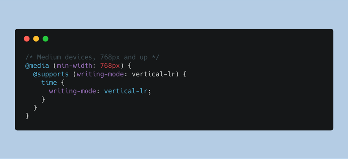
I didn’t know about this CSS property until a while ago, when I stumbled it upon it while reading Ire Aderinokun’s article on Localisation and Translation on the Web.

As a person who mainly works on small teams, I always felt guilty of making accessibility a lower priority. The reasons were multiple and it’s hard to blame someone else other than me.
Over time, I read lots of good articles on accessibility but couple of months ago, I stumbled upon this incredible article by Tuukka Ojala. Both incredible and inspiring, that article remained stuck in my head and hopefully will change the way I write HTML and not only.

I’ve never been a big fan of my very own domain name. Besides the fact that it was quite long, I really hated the hyphens for red-team-design.com.
Two hyphens, the mistakes of my youth.

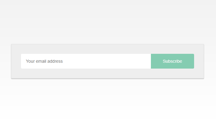
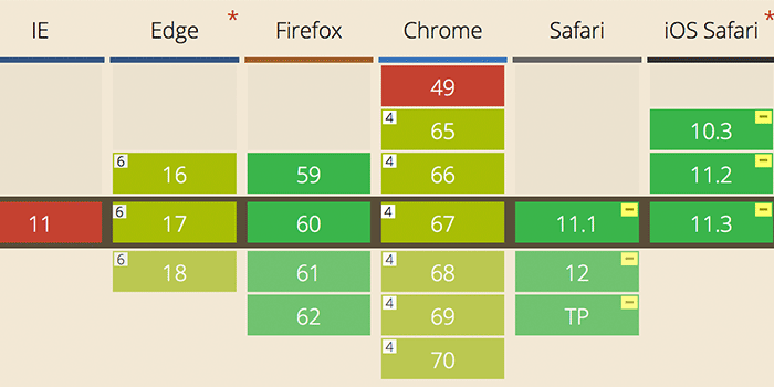
While working on this site, I tried to improve my email subscription box a little bit. The idea was to enable the action button only when the user types something in the email input. So I found a way to use :placeholder-shown CSS pseudo-class in an attempt to visually validate an input before form submission.
