Dribbble invites giveaway
Last month I wrote about my thoughts on becoming a better developer and not only. This time, to help you join the best design community, I have two Dribbble invites for you.

Last month I wrote about my thoughts on becoming a better developer and not only. This time, to help you join the best design community, I have two Dribbble invites for you.

As you might know, the DOM does not support removing an element directly. When removing an element with JavaScript, you must go to its parent first instead. This was always odd and not so straightforward.
According to DOM level 4 specs, which is the current version in development, there are some new handy mutation methods available: append(), prepend(), before(), after(), replace(), and remove(). In this article we’ll focus a bit on one of the new kids on the block, the plain vanilla JavaScript remove() method.

I ask myself this question quite often. What it takes to become a better developer? Not a ninja, guru, master or whatever, but just a better developer. I’m talking about how to improve and learn more every day.

The other day I read a good article on horizontal centering by Roger Johansson in where he explains the shrinkwrapping effect. Basically, it’s about one of the most common problems you can find in the wild, namely how to center a navigation bar that contains floated elements with undefined widths.
As we all know, centering this kind of stuff can be quite tricky sometimes. With this common example in mind, Roger made an awesome list with solutions you can apply in order to achieve horizontal centering.

Check out the Animenu GitHub repository for the updated version of this dropdown navigation concept.
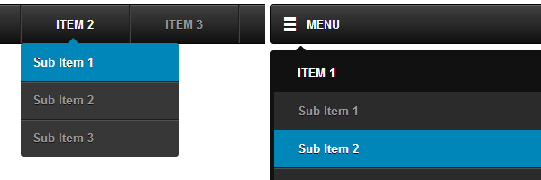
I’ve been pretty happy lately to see I’m still receiving a lot of positive feedback on my animated dropdown menu. I found that quite encouraging and I decided to start working on an improved version of it using SASS & Compass. The new version is responsive, has no JavaScript dependency and it’s hosted on GitHub too.

CSS 3D transforms are just awesome. I’ve seen before some cool and inspiring implementations in the wild and still I can’t believe I didn’t had the chance to write an article on this topic ‘til now.
So, what’s the idea for this article? Let’s say you own a blog, I was thinking about having a nice looking 3D folding list that contains the main social buttons and when people reach at the end of an article, the initial folded list would smoothly unfold. This could be helpful if you want to draw users’ attention, something like: “Hey, did you like my article? Connect with me!”.

I’ve recently watched a good video presentation by Mathias from Fronteers 2012 which I found both interesting and inspirational. I already had in mind some similar things, so I ended up writing this article down. It’s about some random things and facts you may (not) have known about HTML & CSS.

The New Year is coming and I have wrote this short post to thank you all sincerely for reading my articles. I think I should say it more often as well.

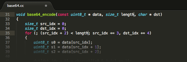
Unless you’ve lived under a rock lately, I’m sure you’ve heard of Sublime Text 2 and most likely that’s your favorite code editor.
In the past I used some other code editors like Komodo Edit or Aptana Studio, but now I use Sublime Text 2 on a daily basis and I’m pretty happy with it. It’s lightweight, easy to use and has a modern UI look. But by far, the best feature is the ability to extend its functionality with plugins, a.k.a packages.

The title pretty much says it all. These days I was working on a small web project and while creating the so well known triangle effect using CSS borders I’ve noticed some rendering inconsistencies on Firefox I thought they were fixed by now.
